
There has been a shift from this kind of portrayal in ads.

Pure N' Fresh has now portrayed women in a more positive note.

Women are shown to be individuals who have needs to pamper and care for themselves.
There has been a shift from this kind of portrayal in ads.
Framework for Analysis
The group shall use the social semiotic theory and multimodal text analysis employed by Koller and Kress and Van Leeuwen as the framework for the analysis of pink as a color denoting femininity. Because color cannot be analyzed in terms of its hue alone, the group will look at other features of the text such as its layout, organization, images and language used. We will also look at how the visual elements and their significance are set in relation to the verbal components of the multimodal text to see if and how the two reinforce, modify or explain each other.
The group attempts to analyze how the color pink effectively denotes post-feminist femininity in women's hygiene products. In line with this, the group will take a look at several feminine wash brands in the Philippines and examine the packaging of their products and their advertisements. We argue that the color pink in this context is used to denote a post-feminist women identity characterized by being fun, fearless, fierce, independent and empowered. This signification of the color pink is achieved together with the other elements of the multimodal texts namely the layout, organization and language.
It is not about vanity but hygiene and healthcare.
The one being pleased here is no other than the woman herself. It is evident through the brand ambassador's thumbs up and smile, as if giving the product an approval. Not to mention, the small logo at the lower right corner, saying that the product is specially made for teenagers, also supports this idea.
As discussed earlier, pink signifies femininity. However, it is important to note that the pink being used here is not just any shade of pink but the blush pink in particular. This very pale pink is consistent in the 3 ads, however, it is not retained just for consistency's sake. The blush pink color of the feminine wash bottles represents not only femininity but also purity and good health. In contrast to darker shades, this variation of pink does not indicate the mature and flirty side of women but rather it brings out their caring and nurturing side, as in the need to tenderly care for their bodies.
Moreover, pink and yellow are not the only dominant colors being used in this ad. It is noticeable that there is an addition of the color purple. Studies have shown that purple is the favorite color of most adolescent girls. Thus, it is no surprise why Pure N' Fresh is capitalizing on purple for their product that is targeted for teenagers.
Purple embodies the balance of red’s stimulation and blue’s calmness. It gives a calming effect to the mind and the nerves in the same sense that Pure N' Fresh leaves women worry free as it keeps them pure, clean and fresh all day.
It is an interesting observation that Pure N' Fresh is no longer offering only the pink variant. Now, the teen feminine wash comes in two other colors such a s yellow and purple. These variants carry different refreshing and yummy fruity scents which are also used as the ad's backdrop. This only suggests that women are no longer limited to the color pink. Thus, their buying capacity and choice, while still limited, are now being extended.
In conclusion, it can be inferred that Pure n' Fresh feminine wash essentializes the post-feminist idea of a fun, free and confident woman. In the advertisements shown, pink is not only used as a marker of femininity but it also functions as a tool for women empowerment.
Pure 'n Fresh feminine wash
by Joana Manuel
Young women today are very different from those of the previous generations. They are now more fun, free and confident.
While the presentation of traditional stereotypes of women is still consistently observed at the present time, the post-feminist idea of a fun, fearless female is becoming more and more prevalent in the market nowadays, as can be seen in beauty and health ads targeted towards women.
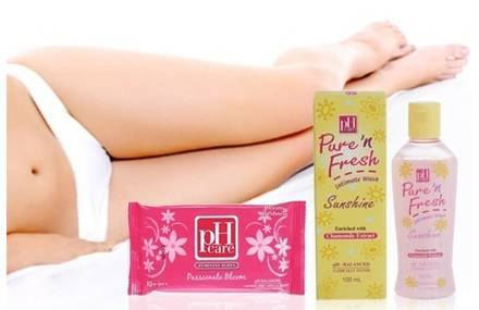
Over the past years, women in commercials are typically portrayed as the stay-at-home ones doing domestic chores, caring for the family. If not, they are usually objectified or fragmented into body parts like the first feminine wash ad of Pure N' Fresh in the slideshow (1/3).
However, there has been a significant shift from this kind of portrayal in ads, probably because of the feminist movement that is aggressively against this poor treatment of women.
Pure N' Fresh, a feminine wash targeted for teenagers, has now portrayed women in a more positive light as can be seen in the second ad (2/3). The young ladies are showcased to be having fun among themselves, smiling and dancing with no care in the world. This type of portrayal is the post-feminist's idea of a fun, free and confident woman.
The pink feminine wash signifies pink power. It embraces the femininity of women and sees it as empowering and liberating. Meanwhile, the yellow flowers signify fun and freshness thereby arousing cheerfulness and producing a warming effect. Moreover, the bright shade of yellow also symbolizes optimism and confidence which functions to lift one's spirit and self-esteem.
Put together, pink as a marker of femininity, and yellow, as a signifier of fun, freshness, optimism and confidence, are communicating the idea of a fun, optimistic and confident female.
There is another advertisement for Pure n' Fresh which is more recent than the previous two (3/3 in the slideshow).
In this ad, women are shown to be individuals who have needs to pamper and care for themselves. This breaks away from the usual portrayal of women who are prioritizing the needs of their husbands and children. Here, the needs of the female is the one being addressed.
It's about the woman and her entitlement of being pampered.
The advertisement is promoting loving oneself by learning to treat one's body right.
Betadine antiseptic feminine wash
by Ena Morales
Betadine, a worldwide trusted brand of wound antiseptic solution, has ventured into producing its own antiseptic feminine wash product. With its wound care products usually coming in yellow packaging (1/4 and 2/4 in the slideshow), Betadine sets its antiseptic feminine wash product apart from the rest it has produced by making use of a light pink bottle to contain the actual feminine wash, while maintaining its minimalistic trademark design on the packaging which only shows the basic information (i.e. the generic name, brand, name, directions for use and so on) about the product (3/4).
In the context of Betadine antiseptic feminine wash, pink is used as an indicator to show that the product is not the usual Betadine wound antiseptic that is usually housed in yellow bottles and tubes. Not only is the color used as a marker of difference from one Betadine product to another (note: the color yellow performs the same function as it helps in distinguishing the wound antiseptic product from the antiseptic feminine wash one, however it is far from being suggestive of femininity as the color itself is tied by the brand to the science of hastening the healing of wounds), but it is also projected as a sign that denotes femininity – which should be the goal of the brand because the product is marketed towards women. The use of pink on the packaging confirms what the color gives rise to, and that is the notion of it being only for women. The connection between pink and femininity and the actual product seems to be arbitrary, but the arbitrariness is in fact addressed and strengthened by the product advertisement. In the TV ad, the pink packaging is used to verify the target market of the product (women), reinforced by the product endorser herself along with other women (4/4 in the slideshow). As shown in the screen-captured TV ad, Bianca Gonzalez is “backed up” by other women in business attire which suggests that the product is mainly marketed towards mature women (and maybe not so much towards young ladies), and that women of today defeat the stay-at-home stigma as they are entitled to perform active roles in the society like having their own jobs. More than that, TV host Bianca Gonzalez as the Betadine feminine wash
ambassadress also reflects the attitudes of the brand towards women by 1) emphasizing that doctors recommend Betadine as it provides women the "protection they deserve, especially during red days"; and by 2) encouraging women to speak up regarding irritation, infection and itchiness down their intimate area. With that said, the TV ad conveys that the brand – with its carefully formulated (7.5%) antinseptic feminine wash product that kills bacteria, viruses and fungi – advocates the protection and empowerment of women.
The reemployment of the same minimalistic design found in other Betadine products strengthens the credibility of the feminine wash as the brand is known for producing effective antiseptic products. With the use of color pink on the packaging, it evokes the idea that the product is not just the usual wound antiseptic solution by Betadine; although still antiseptic, it is not designed to cater to wounds but to women’s intimate area – and pink is clearly an effective semiotic device that supports this. Moreover, at the sight of the rather similar minimalistic label, consumers would know that the feminine wash is by Betadine especially if they have purchased any product by Betadine before.
The color pink, in this sense, is really not just a color; it functions as a marker of distinction between Betadine products, as an identification of the specific target market (women), and as a sign denoting femininity and post-feminist ideology reinforced by the various elements in its very own TV ad.

It is not surprising that pink, a color associated with femininity, is used in the packaging of the product.

Even Lactacyd’s website (www.lactacyd.ph) is clad in pink.
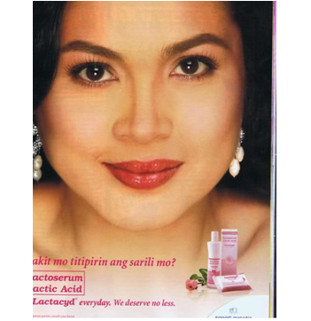
Judy Ann Santos becomes a means of promoting empowerment among targeted female consumers.
It is not surprising that pink, a color associated with femininity, is used in the packaging of the product.
Lactacyd feminine wash
by Kristine Soriano
Lactacyd is one of the leading brands of feminine wash in the Philippines. With its tagline “What’s best for us,” Lactacyd aims to reach out to every woman.
Because Lactacyd is targeting female consumers, it is not surprising that pink, a color associated with femininity, is used as the brand’s color. This is very evident in the packaging of the product.
For example, the first image shows a bottle of Lactacyd feminine wash with its box on the side (1/4 in the slideshow). In the packaging, we see different shades of pink are pale and pastels. The packaging also shows a fusion of pink and white. The use of these shades has to do with the nature of the product. Being a feminine wash, on the one hand, the product has to be identified as feminine, hence the use of pink. On the other hand, the use of white indicates that the product is a hygiene product since white is often associated with purity and cleanliness.
The same color scheme can be observed in the second image showing the packaging of Lactacyd feminine wash. However, an additional element incorporated – the flower. The flower is often used as a symbol for women’s genitalia and thus often associated with women and femininity.
Even Lactacyd’s website (www.lactacyd.ph) is clad in pink (2/4). The entire website’s background is pale – almost white – pink, which again indicates notion of femininity, purity and cleanliness. The brand is consistent in the use of flowers as seen in the background. As aforementioned, flower is a common symbol for the female genitalia and is also a symbol often associated with women.
This screenshot of Lactacyd’s TV advertisement also shows the brand’s consistent use of the color pink and the flower to denote femininity and purity (3/4).
Aside from reaching out to feminine consumers, Lactacyd also promotes feminine individuality. In the screen shot of the brand’s website, the women portrayed wear different styles and color of clothing which may reflect their different personalities and interests. The difference invoked by the image of the three women is reinforced by the text on the left saying “No two women are alike.”
With this, Lactacyd celebrates the different kinds of women and highlights their sense of individuality. However, for Lactacyd, women, no matter how different they are, still have something in common – that they are entitled to make a choice on which variant of feminine wash among Lactacyd’s line of products best that suits them. In the text, the color pink becomes the vehicle for this sense of individuality and power of choice of women.
Finally, Lactacyd also promotes women empowerment. This is achieved through the use of a bankable celebrity endorser Judy Ann Santos who is one of the country’s most respected and most accomplished actresses. Being the ‘face’ – literally and figuratively – of Lactacyd, Judy Ann Santos becomes a means of promoting empowerment among targeted female consumers (4/4 in the slideshow). To add, the caption directly addresses the potential consumer: “Bakit mo titipirin ang sarili mo?” Here, the ad tries to convey that women should not deprive themselves of what is good for them. This idea is reinforced by the tagline “We deserve no less.” Again, Lactacyd is consistent in incorporating the color pink and the flower in establishing its brand. From this, we could derive that pink is used not just to identify with female consumers and indicate femininity, but also, in Lactacyd’s case, to be a color signifying women empowerment.

Worldwide trusted Betadine's yellow packaging for wound care

Worldwide trusted Betadine's yellow packaging for wound care

Pink is used to verify the target market of the product, reinforced by the endorser herself along with other women.
Worldwide trusted Betadine's yellow packaging for wound care
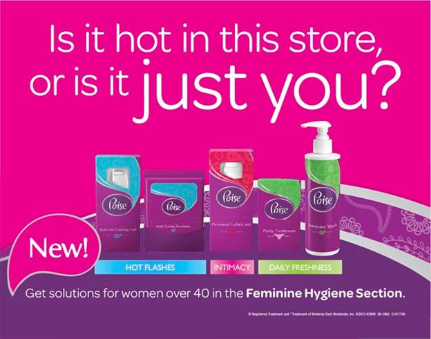
Poise promotes a new kind of feminine wash that is more suited for women over the age of forty.
Poise promotes a new kind of feminine wash that is more suited for women over the age of forty.
Poise feminine wash
by Benedict Santos
Poise is an imported brand of feminine wash available in the Philippines. The Poise brand produces feminine wash for all ages but in this particular ad the company promotes a new kind that is more suited for women over the age of forty (1/1 in the slideshow).
The material at first glance is strikingly feminine and this is due to the different elements used and combined in the text that convey this idea. First, the colors pink and violet. The colors pink and violet are the dominant colors in the material. Colors blue and green were also used in the packaging of the products in the ad and in highlighting the variants of the product. The color pink occupies about half to two-third of the entire material and the color violet occupies about one-third of the material. The color pink according to Koller (2008) functions as a marker of femininity. True enough the color pink in the ad is given a feminine interpretation given its semiotic environment in which it is a part of, and thus its dominance in the ad strongly suggested femininity. The color violet is another color used in the material, whose hue is close to the color pink, that is usually seen as feminine. The color violet is widely and commonly interpreted as a regal color, which not only supports pink’s femininity but also bolsters its meaning by adding a tinge of power that validates the post-feminist identity forwarded by the use of the color pink in contemporary society.
Second, the use of flower patterns in the middle part of the advertisement also supports the femininity conveyed by the color pink and the entire material. Flower is a widely known metaphor for women’s genitalia because of their semblance to each other. Flower in our society has also achieved a romantic image and appeal especially among women. One proof of this is how floral prints are more common in women’s clothing. We don’t usually see men wearing clothes that have floral prints maybe except on the beach. The use of this semiotic element combines with other elements to achieve an overall image conveyed by the material, which is femininity in support of a feminine product.
Third, the written content of the material: the brand name itself talks of something seen as being mostly associated with women – poise. Poise is a state of being composed and mannered, which is something that we expect of women and every time this expectation is being unmet we instinctively know that the woman is behaving unbecomingly, whereas poise in men are only expected, even minimally, from those who hold positions in the society. Another is the banner statement used in the advertisement that says, “Is it hot in this store, or is it just you?” The banner statement allows multiple interpretations. Let’s look at hotness as emanating from the ‘you’ being addressed in the statement since. It could be construed as the hotness emanating from the menstruation experienced by the woman that may cause discomfort, which their product may be able to relieve.
It may also be construed as hotness in the sense of sexual appeal that may ensue from the confidence given by the use of their feminine wash. The ‘just you’ in the material uses a larger font compared to the other words in the banner statement. This enlargement of the words ‘just’ and ‘you’ works well with the second interpretation. The ‘just you’ in larger font communicates more powerfully to women and seems to create a focalized experience for them. The hotness seems to be imposed on women, which may be seen as advantageous. The image of being hot may also communicate power and independence, which are the very things at the core of post-feminist identity. Also, the names of the variants of the feminine wash also have a touch of femininity like “hot flashes,” “intimacy,” and “daily freshness.”
The interpretation of color pink in this advertisement is largely dependent on the meaningful environment in which it exists. The written content and other visual markers help us interpret the entire message of the text and the possible meanings of every element in the text. The color pink has achieved a feminine identity because of its constant use along with other feminine markers in materials intended to express the female gender.
Lastly, the advertisement endorses a feminine wash specifically for women over the age of forty. Provision of specific products for specific groups of consumers may be seen as an acknowledgement not only of one’s expanding needs but also of one’s identity and worth. Even just the existence of a myriad of brands of feminine wash already tells us that women are now seen as active participants in the economy. They are now seen as members possessing economic power whose interests should be well taken care of by providing for their needs. This acknowledgement helps build the post-feminist identity forwarded by the color pink according to Koller (2008), which assumes an identity conveying autonomy and confidence.